Adapting, growing and learning

Olicatessen restyling

On this occasion, we detail the olicatessen restyling process.

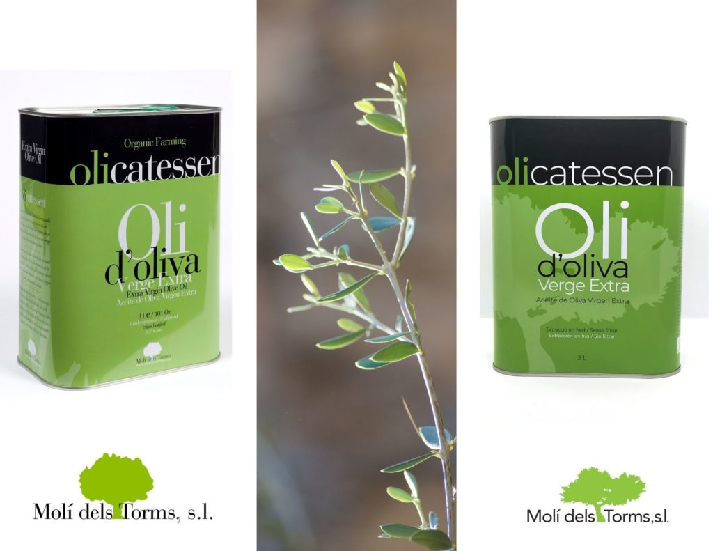
As you have seen, both the typography and the logos and labels / packaging have changed (or will change).

When a process of rethinking a point begins (we started with the web, …), many other variables appear that require that they also be rethought.

It was important to make the labeling easier to read.

The regulations require us to include a lot of information that makes it difficult for designers to make the “watermarks” they like, and for us to explain everything we want.

The first point we worked on was the typography (the font).

The fonts that have “serif”, like the one we had, make reading difficult for dyslexic people or some other difficulty with reading and writing. And since at home we have been closely touched, well, we have chosen a #dislexiafriendly typography.

Being a truly clear shape-letter, only with that he already modified the presence a lot

comparativa_logo_olicatessen

And on the other hand, we have either eliminated or blurred all the backgrounds (degraded) of the containers to facilitate reading and transmit more clarity.

comparativa_llauna

Finally, and at this point comes the environmental – ecological responsibility that we have integrated into our DNA, the outer boxes become kraft, without painting.

One more drop to make a world a little more sustainable.

Little by little, you will start to see the new designs!!!

Comparteix

Share on facebook
Share on twitter
Open chat
May I help you?
Contact with Olicatessen
Hello, how can We help you?